Redesigning the Visual Identity of Quant Group and Its Sub-Brands for a Cohesive and Modern Brand Presence
Project Type
Branding Visual Identity Web Design & Development
Industry
Renewable Energy
Client
Quant Sanierungs GmbH

Lack of Cohesion and Clarity in Branding
Quant Group, encompassing multiple sub-brands including Quant Solar, faced significant challenges with its existing branding. The old logo was plagued with inconsistencies and design flaws, leading to confusion in brand recognition and an unclear visual identity across various sub-brands. Additionally, there was no clear guideline on how to visually distinguish and brand these sub-brands under the Quant umbrella. This lack of a unified branding strategy made it difficult for Quant to present a cohesive and professional image, especially in the competitive fields of real estate and renewable energy solutions
Understanding the Brand’s Core Values and Audience
The discovery phase involved a deep dive into Quant’s brand essence, values, and target audience. With a foundation rooted in reliability, innovation, sustainability, and expertise, Quant aimed to reflect these values across its entire visual identity. The brand also needed to appeal to a diverse target audience, including property owners, buyers, investors, and partners in the real estate and energy sectors. Through discussions and analysis, it became clear that a modern, minimalistic approach would best capture Quant’s pioneering spirit while maintaining a professional and trustworthy image.
Crafting a Unified and Flexible Brand Identity
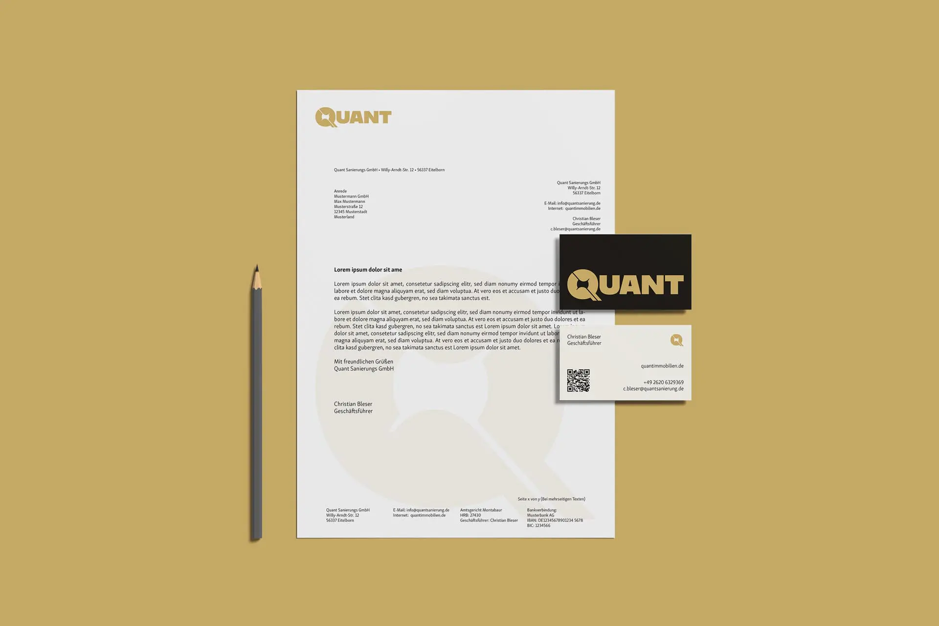
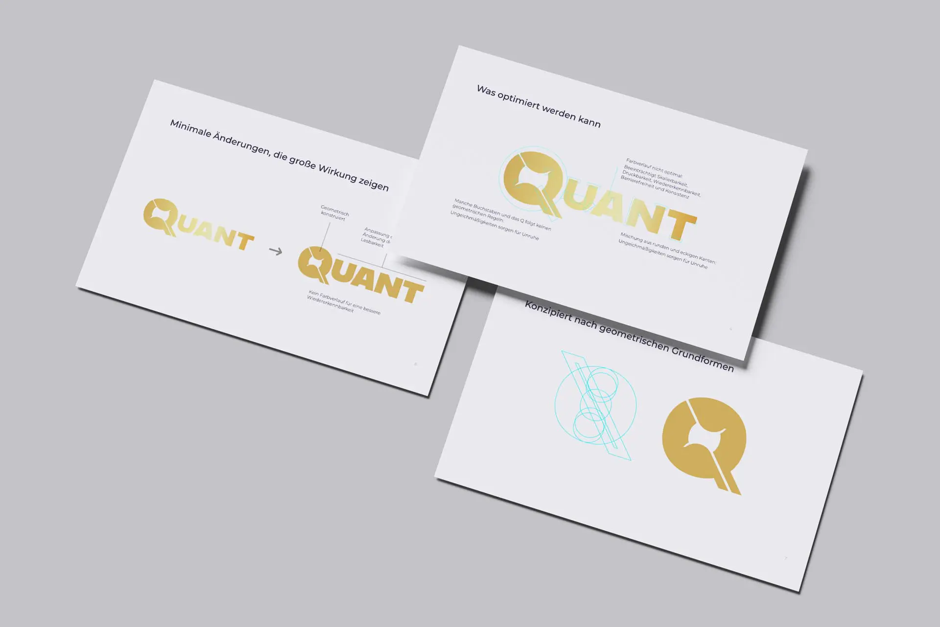
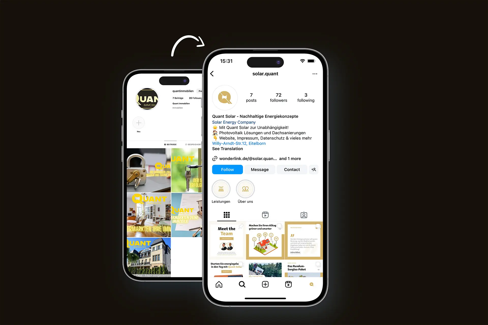
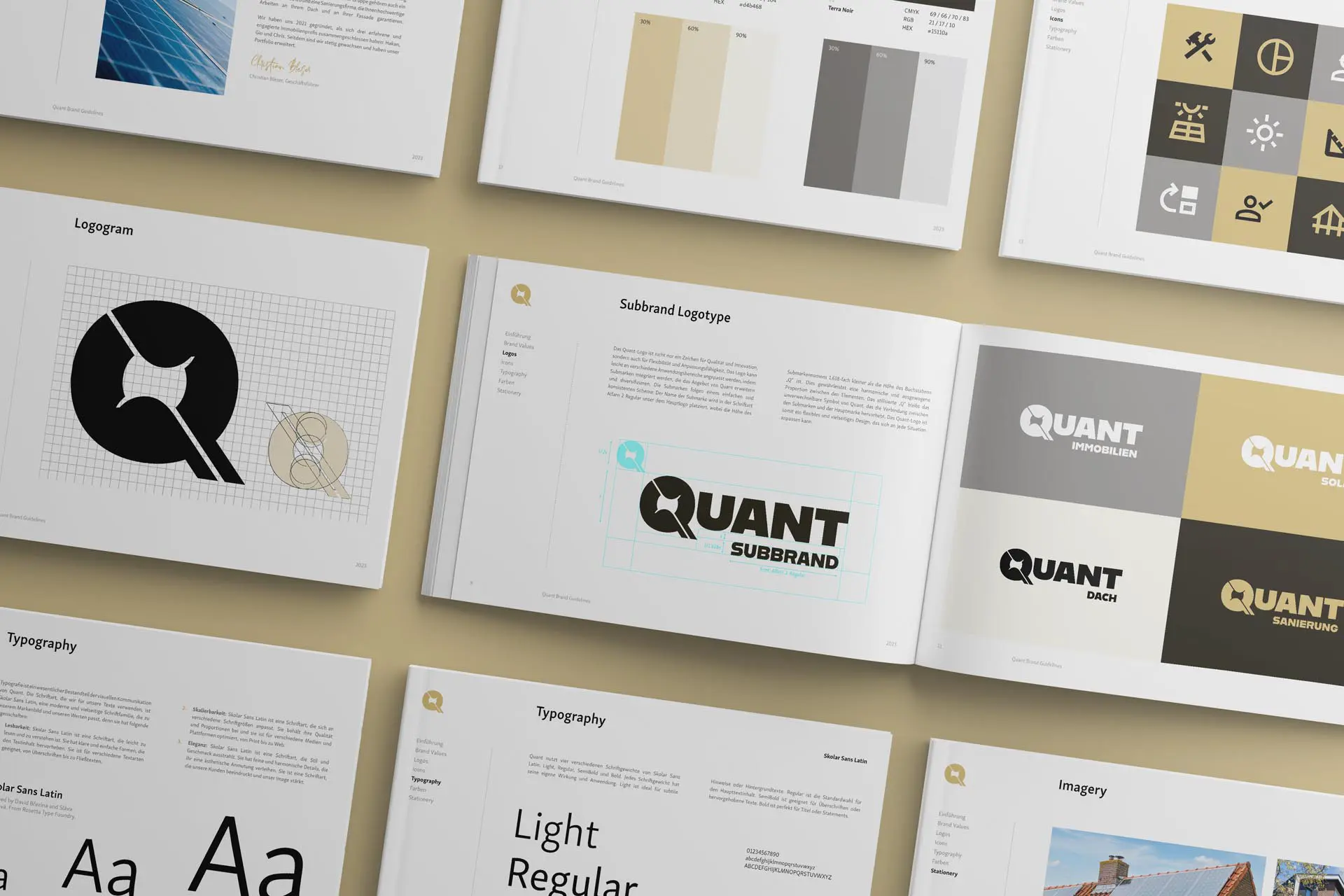
The design process focused on creating a cohesive visual identity that could be seamlessly applied across Quant and its sub-brands. The primary logo was redesigned with a bold, modern typeface and a creatively modified "Q" that symbolized innovation and flexibility. A set of brand guidelines was developed, covering logo usage, typography, colors, and brand values. The guidelines specified how sub-brands would be visually represented, using a consistent layout where sub-brand names are positioned under the main Quant logo in a specific proportional size, ensuring a balanced and unified look. Typography was carefully selected, with Skolar Sans Latin chosen for its readability, elegance, and scalability across various platforms. Color choices, including Terra Gold and Terra Noir, were strategically picked to convey optimism, creativity, and professionalism.
A Modern, Cohesive Brand Identity with Strategic Visual Elements
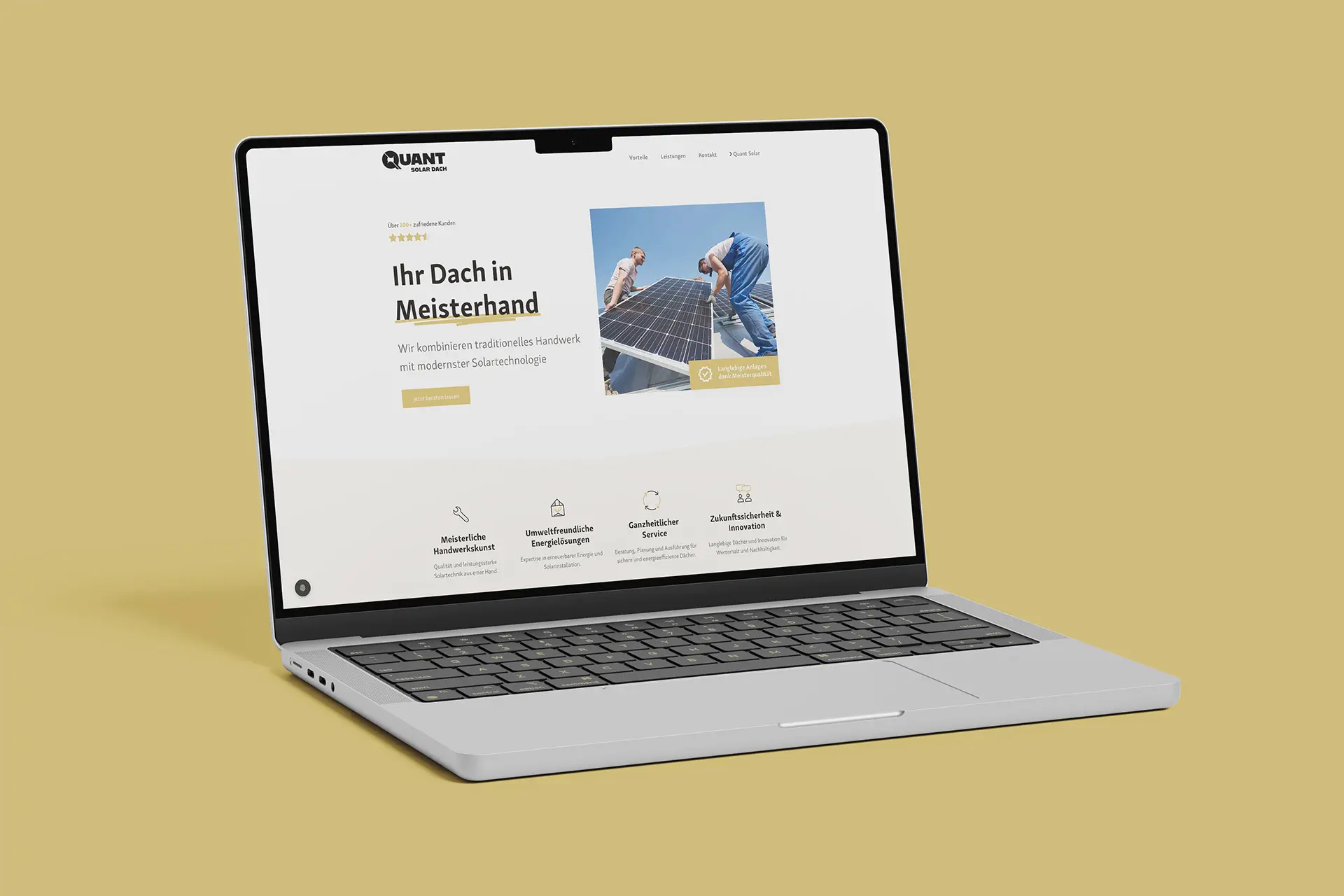
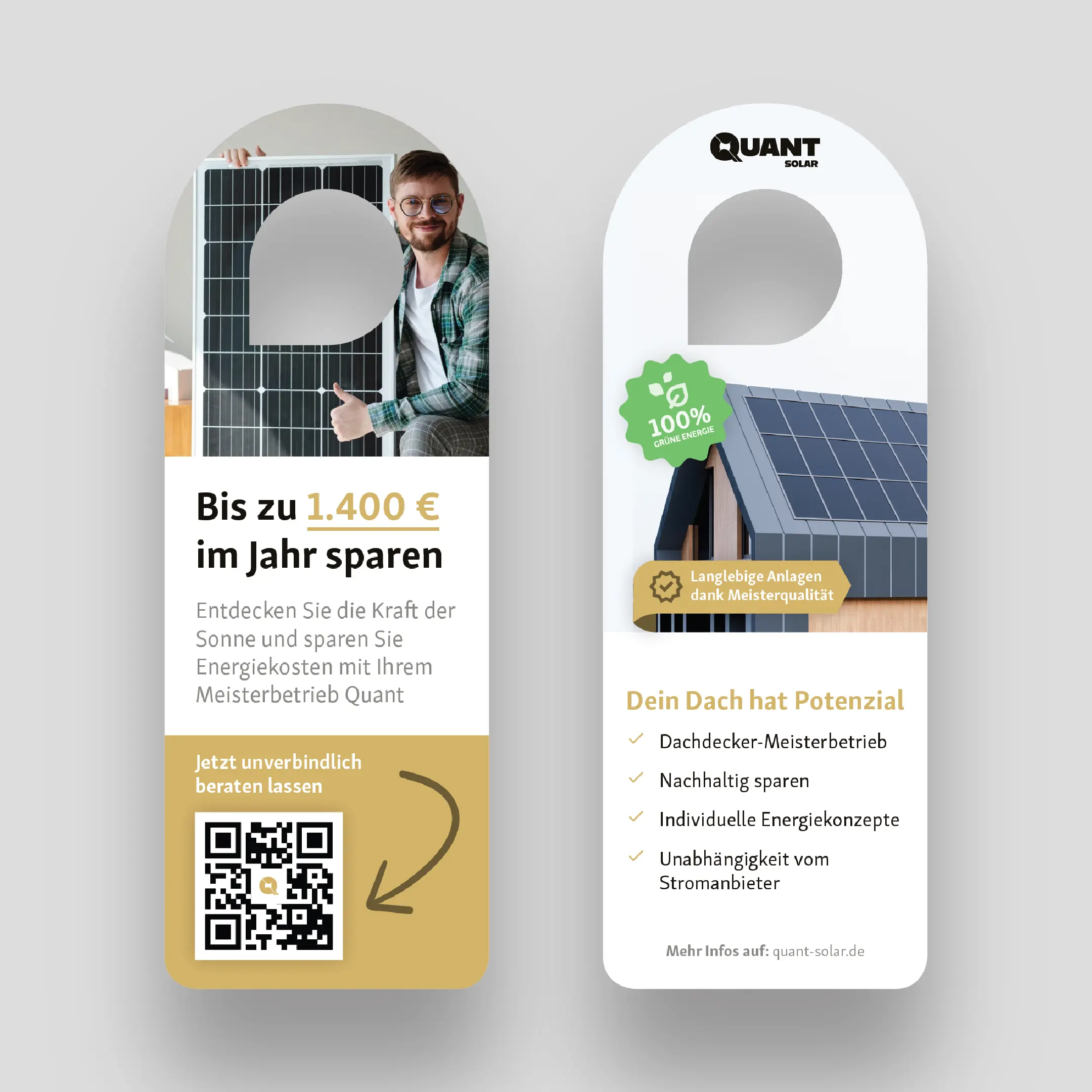
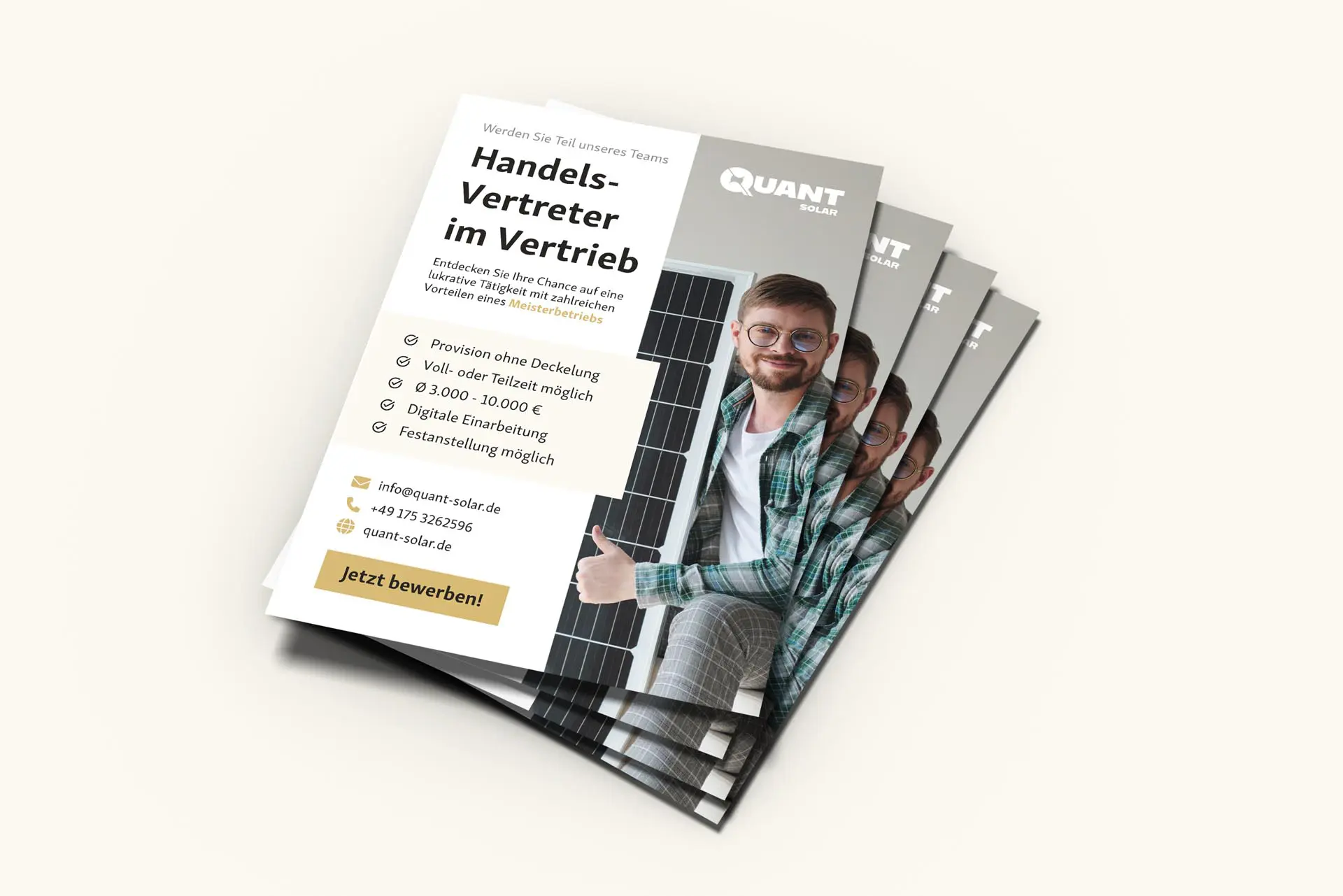
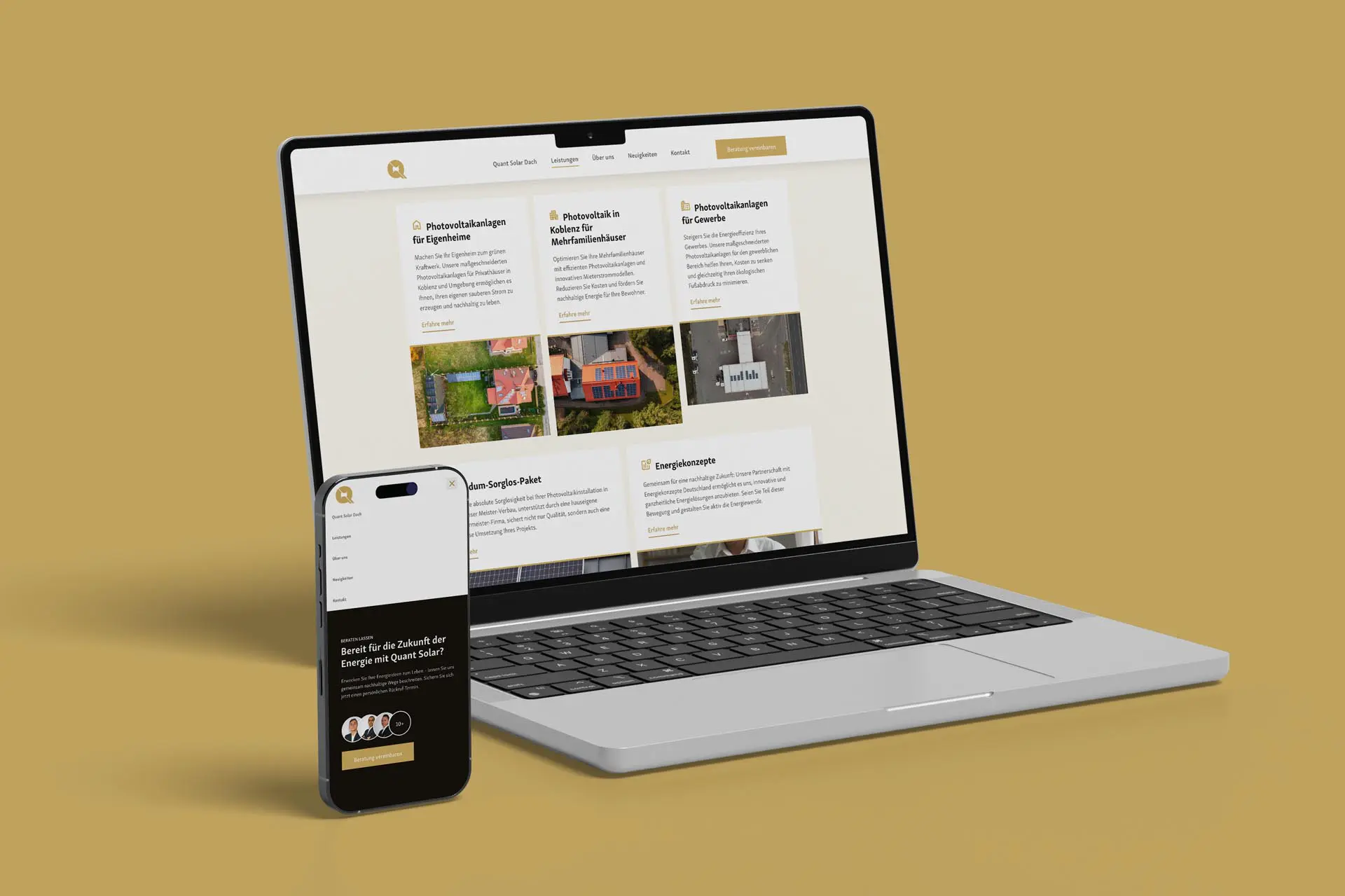
The final solution included a comprehensive brand identity that clearly delineated Quant and its sub-brands. The new logos are minimalistic yet impactful, reflecting the company’s commitment to innovation and quality. The brand guidelines ensure consistency in the application of the logo, typography, and colors, providing clear instructions on how to represent the sub-brands in a way that aligns with Quant’s overarching identity. The use of Terra Gold and Terra Noir created a striking contrast, enhancing the visual appeal and making the brand stand out in both the real estate and renewable energy markets. In addition to the branding, a sales-focused, SEO-optimized website was developed, along with various print and digital materials, including flyers, social media posts, business cards, and stationery, to solidify Quant's market presence.

Lessons in Creating a Flexible and Scalable Brand System
This project underscored the importance of flexibility and scalability in brand design, particularly for a company with multiple sub-brands like Quant. By developing a unified yet adaptable visual identity, the project demonstrated how strategic branding can enhance brand recognition and customer trust. Working on the Quant project reinforced the significance of detailed brand guidelines to maintain consistency across all brand touchpoints. The experience highlighted the need for a balance between creativity and practicality, ensuring that the brand identity is not only visually appealing but also functional across various media and applications. Moving forward, this project serves as a blueprint for approaching complex branding challenges with a holistic and systematic design strategy.