Redesigning the DB Business Charging Card for Enhanced Usability and Aesthetic Appeal
Project Type
Brand Design Print Design
Industry
Sustainable Mobility Transportation
Client
Deutsche Bahn Connect GmbH

The Challenge: Redefining Usability and Aesthetics for a Sustainable Future
The DB Connect Business Charging Card, used by employees to access over 500,000 EnBW charging points, faced significant design challenges. The original card was cluttered and visually unappealing, making it difficult for users to quickly locate relevant information. As the card represents DB Connect's commitment to sustainability, it was crucial to align the design with this ethos while enhancing the user experience.

Simplifying for Elegance and Usability
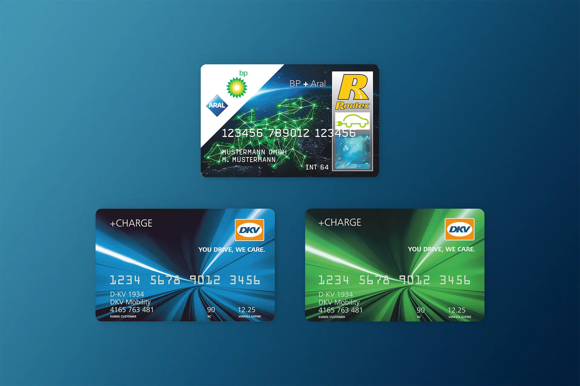
The redesign process began with thorough market research. By examining existing charging cards from well-known brands in Germany, such as those from BP, Aral, and DKV it became clear that these cards lacked aesthetic appeal. They relied heavily on generic stock images that, while aiming to represent the digital age, felt overused and uninspired. The cluttered design made important information like card numbers and text difficult to read, detracting from user experience.
Refining the Design for Clarity and Impact
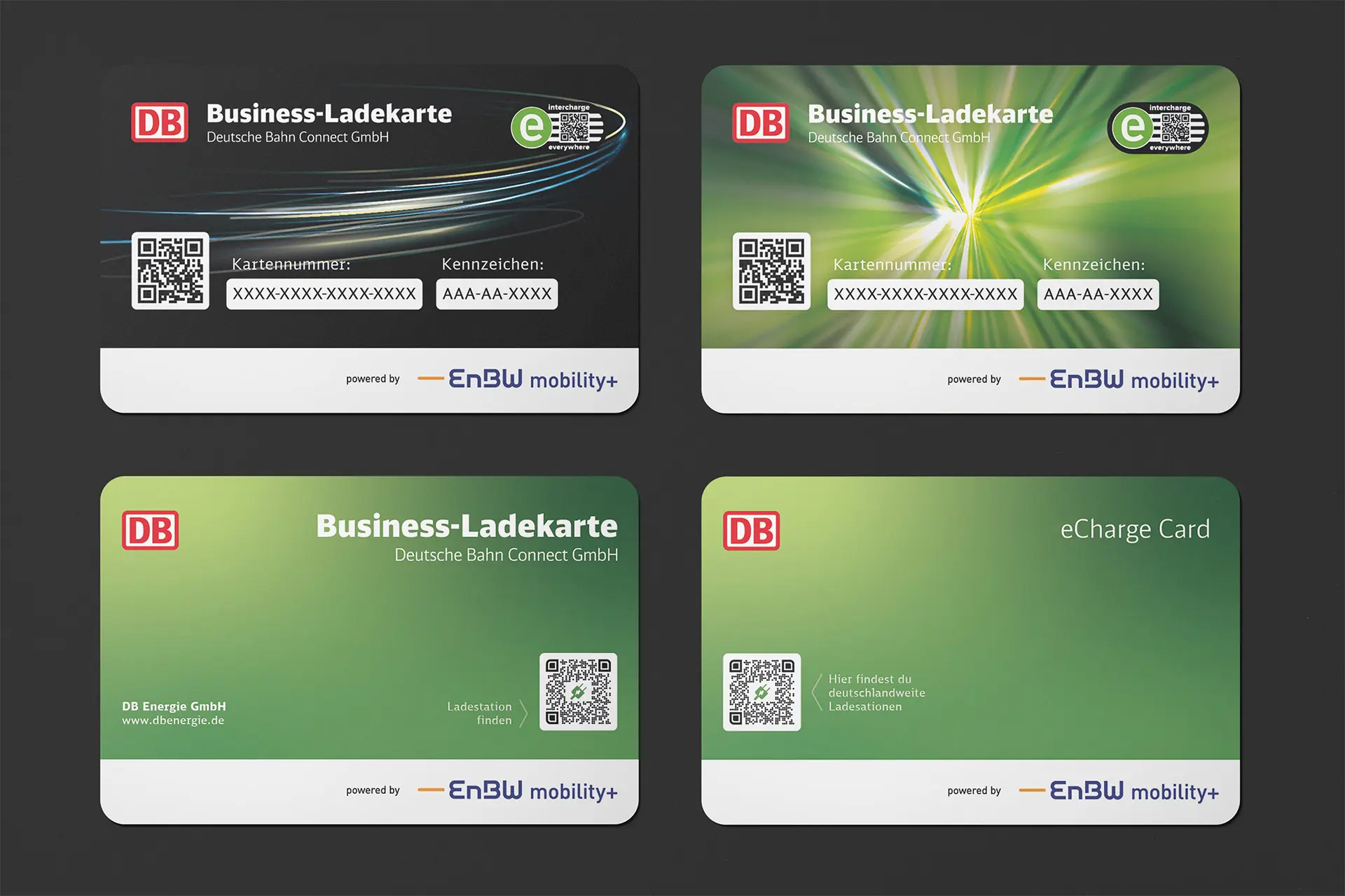
In my initial design drafts, I experimented with various backgrounds that emphasised green energy and the flow of energy. However, I quickly realised that these complex backgrounds contributed to a cluttered appearance, similar to what I had observed in competitor cards. To address this, I transitioned to a simpler background color that allowed the design elements to breathe and the necessary information to stand out clearly. Additionally, I tested different font weights and placements, along with various arrangements of the card’s elements, ultimately arriving at a clean, modern design that effectively highlights Deutsche Bahn's commitment to sustainability while improving usability.
The Solution: A Modern, Clean, and Purposeful Redesign
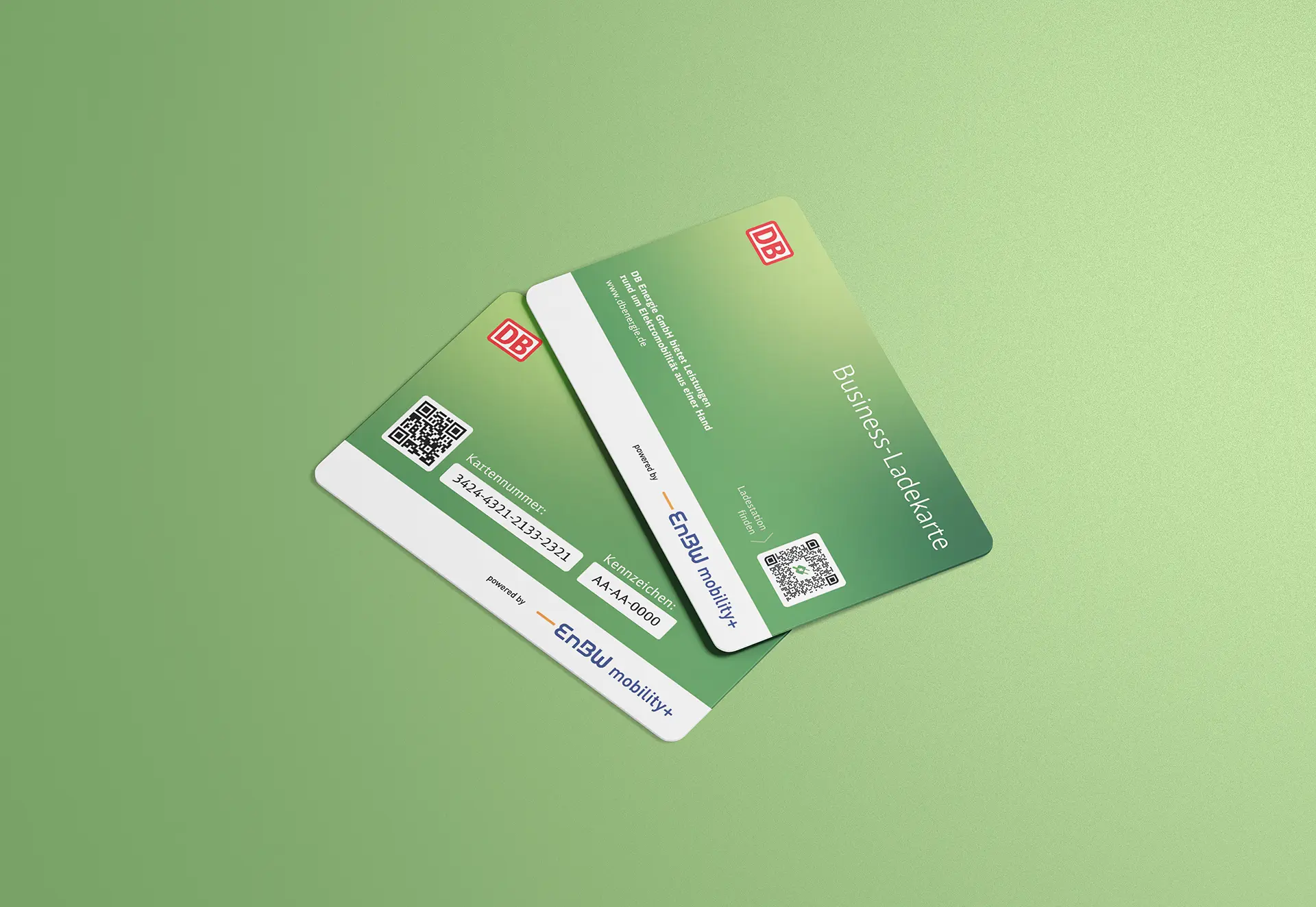
To address the challenges, the DB Charging Card was reimagined with a focus on clarity, modernity, and sustainability. The new design features a soft green gradient, symbolizing the company’s sustainable approach and the flow of energy. The light gradient not only adds a sense of movement but also reflects the innovative nature of DB Connect’s services. The typeface chosen is sleek and modern, contributing to the card’s fresh look, while maintaining readability. The co-branding elements are thoughtfully separated, ensuring that the DB logo stands out prominently, reinforcing brand recognition. The overall design is minimalistic yet impactful, making it easy for users to find the information they need quickly and effortlessly.


Lessons Learned
This project reinforced the importance of client collaboration and the iterative design process. Navigating multiple feedback loops with the client was crucial in refining the design to meet all requirements and expectations. One of the key takeaways was learning how to balance aesthetics with functionality—ensuring that the card was not only visually appealing but also made critical information easily accessible. This experience has deepened my understanding of how to create designs that are both beautiful and practical, which I will carry forward into future projects.

