Rebranding a 150+ Person International Logistics Business Across Nine Locations
Project Type
Brand Strategy Visual Identity System
Industry
Global Logistics
Client
Henning Harders (Australia) Pty Ltd

A Brand Without Structure
Over nearly four decades, Henning Harders had grown into a respected international freight forwarding and customs brokerage business. However, the brand had evolved organically without a defined system. Multiple logo variations were in circulation, several taglines were being used simultaneously, colour usage lacked consistency, and sub-brands had no clear architecture. The organisation also relied heavily on an external agency for design execution, meaning brand knowledge and asset control were not internalised. As the company expanded across Australia and New Zealand, the absence of a scalable, governed brand system became increasingly visible.
Aligning Legacy with Future Direction
The first phase focused on strategic alignment. This kind of transformation had never been undertaken internally, so defining a roadmap was a challenge in itself. Workshops and leadership discussions were essential to clarify ambition, positioning and long-term direction. A key insight emerged: the brand needed to modernise and simplify without losing the trust and family values built since 1987. Shortening the name, introducing a clear visual structure and creating internal ownership were identified as critical priorities. Equally important was preparing the organisation for governance, ensuring that whatever system was built could realistically be adopted across nine locations.

Building a System, Not Just an Identity
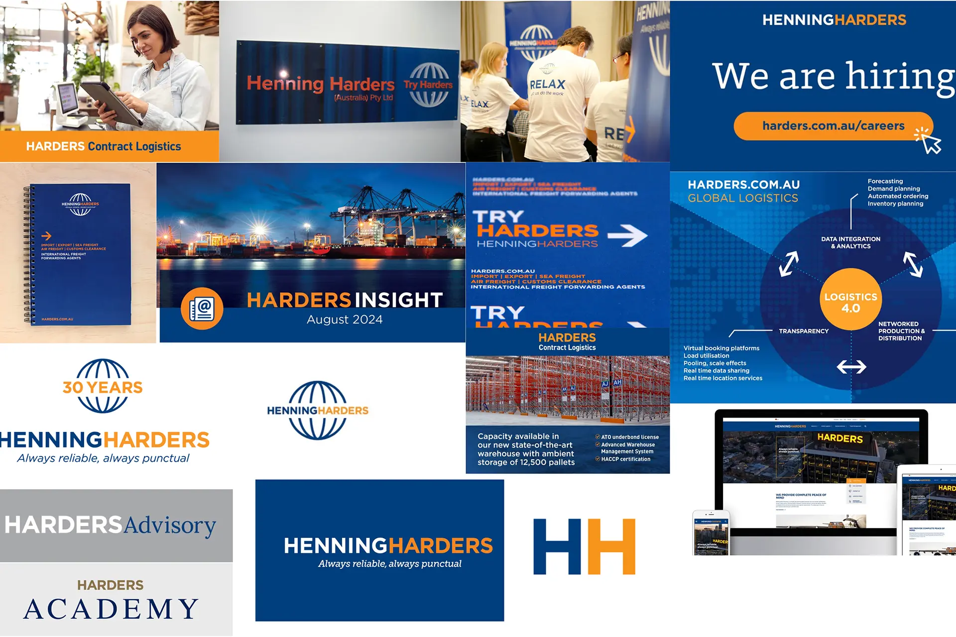
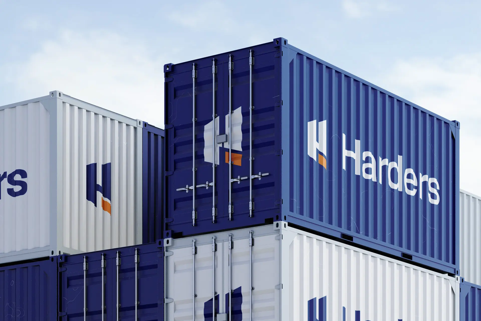
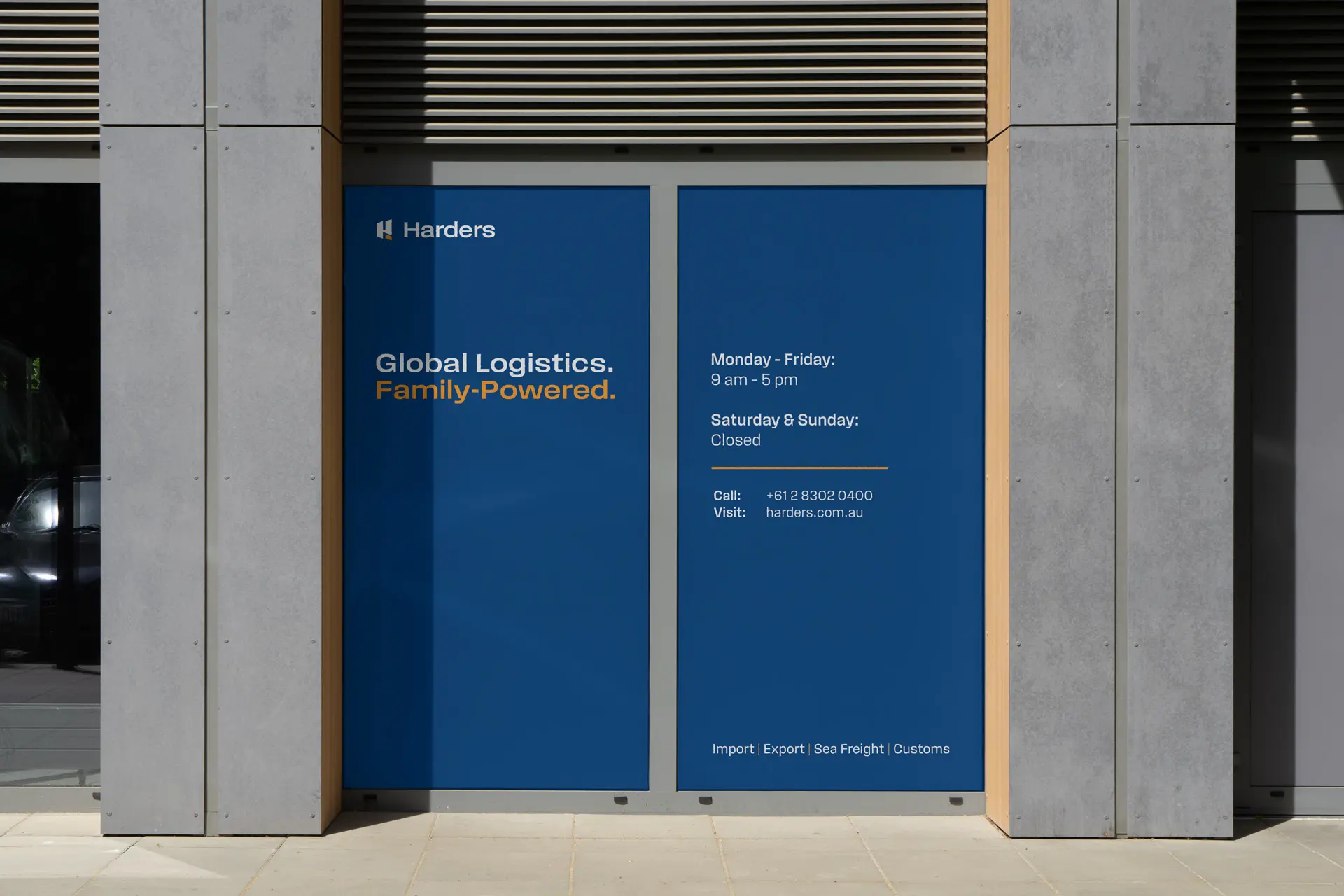
From strategy through to execution, the transformation was developed end-to-end in-house. The focus was not simply to design a new logo, but to create a structured, scalable brand system. This included refining and shortening the name, developing a single clear symbol, defining a cohesive colour palette and establishing a unified tagline. A custom typeface, Harders Sans, was created to strengthen brand distinctiveness and consistency. Beyond the core identity, the work extended into operational reality: templates, documentation, Microsoft theming, social assets, signage, customs documentation and internal communications. Each element was designed to ensure clarity, usability and long-term governance.

From External Dependency to Internal Ownership
The result is a unified, modern brand system now rolled out across nine locations in Australia and New Zealand. The organisation now operates with one structured logo system, one defined visual language and one clear brand direction. Governance mechanisms and templates ensure consistent usage across departments and branches. Most importantly, brand execution is now fully internalised. Harders no longer depends on external agencies for everyday brand development, allowing the business to move faster, remain consistent and maintain control of its identity.


Designing Change Beyond Visuals (Lessons Learned)
The most complex challenge was not visual design, but alignment and governance. Navigating differing perspectives within a family-owned business required patience and trust. Building adoption across nine locations required clarity and structure. This project reinforced that brand transformation is as much about systems and leadership as it is about aesthetics. Designing the identity was one part; embedding it into an organisation was the real work. The foundation is now in place, and the brand continues to evolve.


